On Tuesday I began to lose my voice. It isn't as uncommon an occurrence as you might think; I lose my speaking voice about once a year to sinus infections, so I've learned to soldier on through. The main problem with this problem is the troubling fact that I make my living by talking. I have to stand in front of a group of people for hours at a time and talk. So when I come to weeks like this one, where the next week is break and the weeks following are devoted to student presentations so I can't cancel class, I have to come up with creative ways to teach my material without talking as much.
Enter PowerPoint. Most of my classrooms are what the university has designated ILE - Ideal Learning Environments. Unfortunately, ILE is simply code for "has a computer and projector and document camera," not "has comfortable seats, is a comfortable temperature, has an in-tune piano, and has a coffee bar at the back." I suppose that would be too ideal. But you take what you can get.
Before coming here, I had never used PowerPoint in the classroom before, so I've been on a steep learning curve. But I've figured out a few tricks that I'd like to share, mainly because I've seen it used poorly so often that I feel posting this can count as community, nay, service to mankind in my tenure portfolio.
Lesson 1: Omit Needless WordsMost of you will recognize that I'm stealing my first lesson directly from
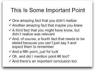
Mr. Strunk, but it holds true for PowerPoint as well. Most slides look like this wonderful one I stole from
intuitive.com:

That is an incredible amount of text to read through. And do you know what happens the instant a screen with a lot of text is unveiled? All eyes dart to their paper to write down everything on the slide and their ears turn off. For the next four to five minutes (at least) you have lost your class. Now, occasionally you want them to write everything down you have on the slide because you are giving lists of musical works or obscure titles, so how do you have the best of both worlds? Bring in each section one by one. That way you can give them time to write down what you want to make sure they have down and have time to talk to them as well. But by and large, do not put large amounts of text on a slide.
Lesson 2: Use Slides to Enhance your WordsI'll give you an example of what I mean by this lesson. Yesterday, I had a presentation of the revisions I've made to my syllabus in response to the diversity training I've received this semester. Most people simply put their syllabi up on the screen and talked us through step by step. Of course, you now know what happened - we all began reading and stopped listening. For my presentation, I wanted to take them through my thought process in revising this syllabus.


So I began with a series of 15 slides of pictures of composers along with their names and dates. Then, while describing the current state of the canon in music history, these images flashed rhythmically behind me. I didn't draw attention to them until they were halfway through at which point I asked my audience if they noticed anything similar in the pictures - they all got my point that music history is usually taught as a progression of dead white European males. More to the point, they were listening to me the entire time and the images served to punctuate what I was saying. If you haven't seen Al Gore's
An Inconvenient Truth, you should just to watch how well Gore has mastered this skill.
Lesson 3: Don't be afraid of a Black ScreenToo often we leave up slides long after their relevance is gone. We aren't quite ready to move on to the next slide so it just remains. So our students stare at the information or images on the screen simply because they are conditioned to look at screens (ever try to talk while the TV is on mute? You still watch it). I've learned that you only put images up on a slide as long as you want your students to see them. As soon as you've moved on, go to a black screen. I literally put in black slides that I've turned the background to black so nothing is there for them to look at but me. It is all a matter of rhythm and timing, just like in theater, so make sure you know what words you want the slide to appear with and with what words it should disappear. Using PowerPoint in this manner makes for dramatic reveals and so is effective in helping with Lesson 2.
Lesson 4: Less is MoreAbove all in using PowerPoint in the classroom, remember that less is more. Imagine PowerPoint as a huge, delicious cake like the ones you get from Costco with the cheesecake filling and the mounds of icing. Those cakes are amazing and delicious and always welcome. But after you've eaten a small piece, you've about had all the Costco cake you can handle. If you eat a large piece, you'll probably be feeling it for a while. And if you eat more than one piece, you might just have a heart attack. Treat your slides like pieces of Costco cake. If you give your students tons of cake, they become lethargic and bloated and want nothing more than to go lie down. But if you only give them a little at a time, it is a delicious treat and they come back wanting more. Your PowerPoint is cake, so use it wisely. I like to throw one provocative statement on the screen like this one:

Just putting that up and letting my students read it always gets them talking. It starts slowly, but as long as that slide is up, they are talking. I, of course, follow it with a black screen.
Ok, I need to go and soldier through my class and see how much I can communicate and get them to talk with my PowerPoint. I'd welcome any suggestions you have as to the effective use of PowerPoint in your classrooms or even tales of PowerPoint gone awry.
 Misty has a better camera and took much better pictures involving the entire clan. If you really want to see how Eli and Sam "played together," click on this picture she took and you can see her wonderful set of Beach pictures:


